
💻 Thunkable Interface
Designer
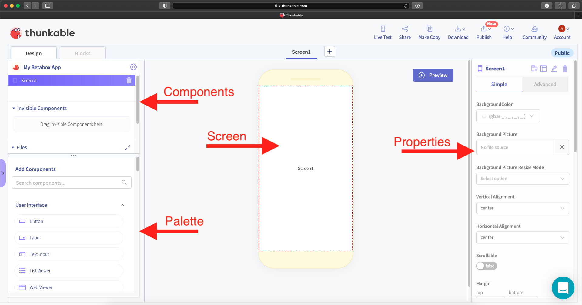
The designer is where you will design your apps, with things like background pictures, buttons, text, and more.
- Screen: Let’s you see what your app will look like on your phone.
- Components: Where you can see all of the components you’re using and how they’re arranged on your screen.
- Palette: Where you will find new components to add to your screen such as labels, buttons, pictures etc… Think of this as the features section.
- Properties: Where you can modify (change) the properties of any of your components like height, width, size, color, spacing, and more! You can change how your components look here.
Blocks
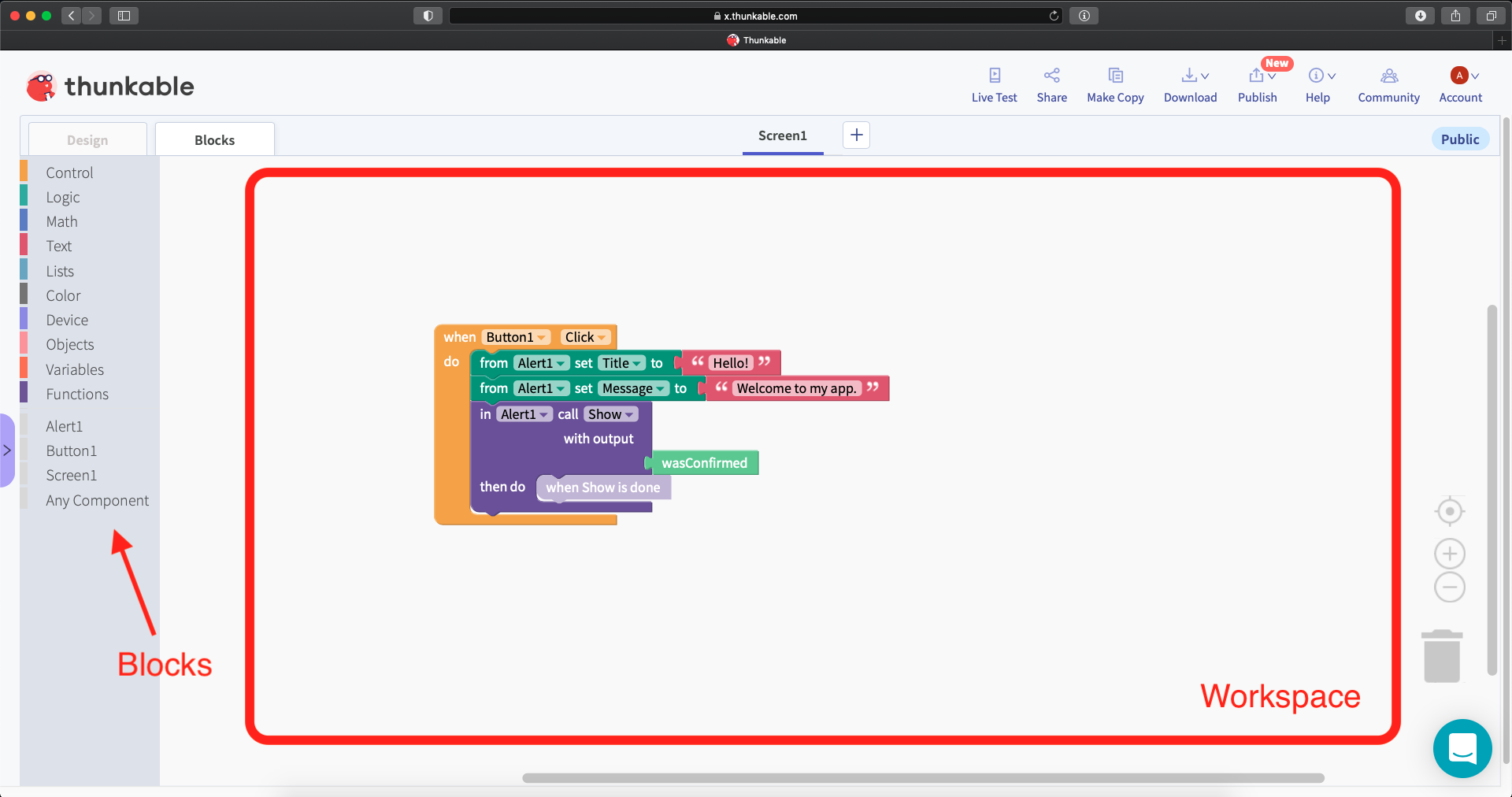
The blocks panel is where you will write the code to make your app work. It’s broken into two sections: generic blocks (top) and component blocks (bottom).
- Generic blocks are blocks for generic tasks, like adding two numbers together, writing some text, or checking “if” a certain condition is true.
- Component blocks are blocks directly related to components you have on your screen. For example, if you had a button you could use the “when the button is clicked” block to make something happen when the button is clicked.
Workspace
The workspace is where you will use the blocks to write code. In the picture above, you can see a block with “Button1 .Click”, which means I’m telling the app to do something when “Button1” is clicked.